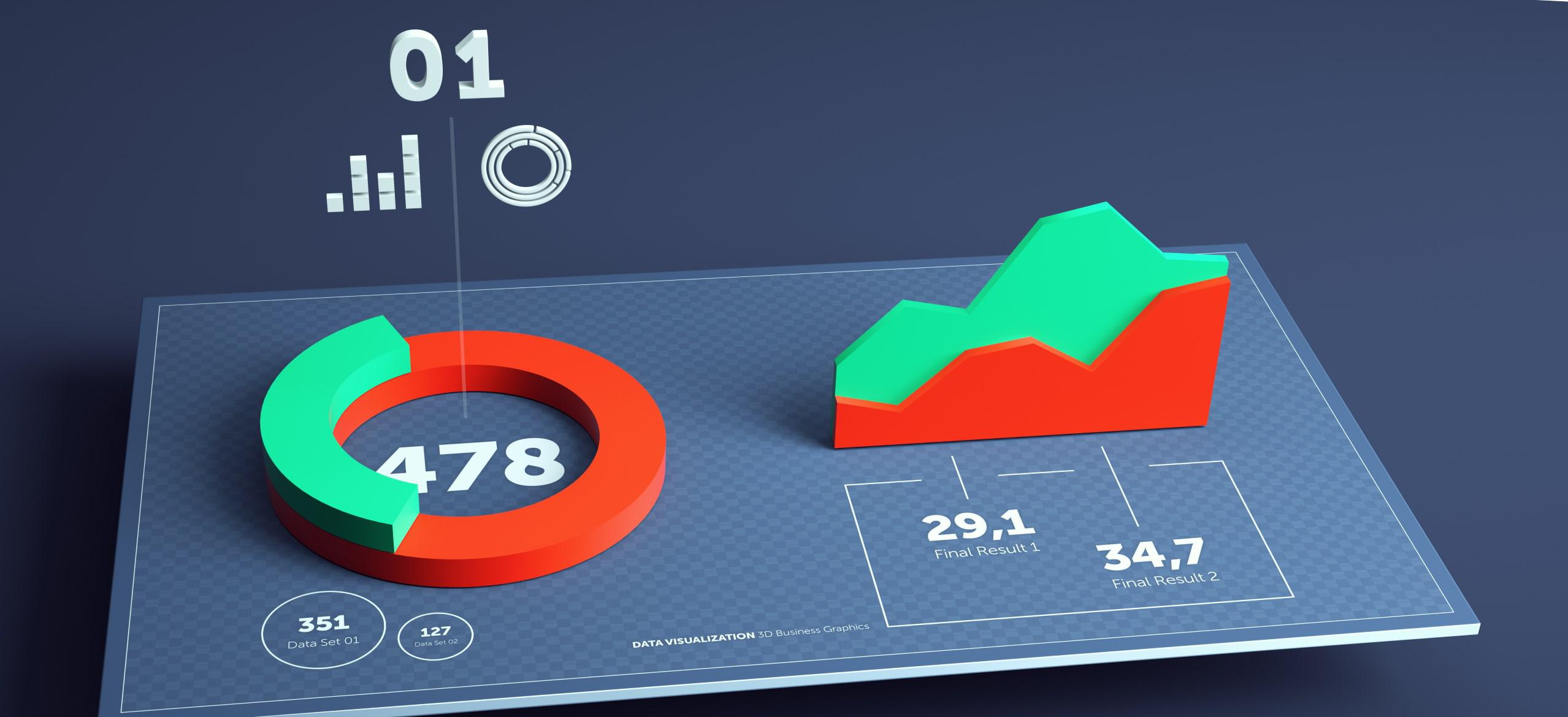
Corporations tend to generate massive amounts of data in the process of offering goods and services to clients. The information is presented as random numerical values whose meaning cannot be understood unless it is provided logically. Data Visualization plays a huge role in ensuring that the managerial team can understand the presented analytics so that it is possible to make proper decisions that will affect the enterprise positively.
A picture is worth a thousand words, and data visualizations employs the power of pictorial presentation to expound the meaning of numerical values that are obtained. Companies that invest in data visualization stand to benefit as it becomes easy to analyze and predict the future. When data is presented using graphs and charts, it becomes easy to grasp unlike when it is shown on reports and spreadsheets.
In addition to presentation of data in an easy to understand format, visualization enables the managerial team to;
Common Data Visualization tools
- Identify business processes that need alteration before they affect the organization negatively.
- Outline the factors that influence the client behavior.
- Understand where particular products should be positioned.
- Predict the expected volume of sales.
Data Driven Documents (D3.js)
It uses SVG, HTML, and CSS to develop captivating charts that can be utilized within any business environment. It is free to use and has extensive features that provide the user with unlimited options.
Google Charts
It is versatile since it can be used on different platforms. Additionally, it presents data without any alterations irrespective of the platform used.
Chart.js
It is most suitable for minimal projects and supports a limited number of chart types.
Dygraphs
It has been developed using JavaScript, and it is capable of handling massive sets of data quickly and flexibly.
Leaflet
It provides the users with diversity and can easily be used on mobile handsets due to its small size (33kb). It employs CSS and HTML 5 to produce maps that are very interactive, and it can be used on any platform whatsoever.
Fusion Charts
It is the only visualization tool that provides the widest range of maps (965) and graphs (over 90). Charts can be exported in any format and data types that subscribe to XML and JSON can readily be used in this case.
The Best Visualization Tools in today’s market
In today’s business market, enterprises need to be competitive, and therefore, adopting a data visualization tool is almost inevitable.
Tableau
It is a very simple to understand and use, and that is why it is considered to be the best in today’s business market. The client base associated with tableau is very extensive, and at the moment, there are approximately 57,000 Tableau accounts that have been set up. For massive data sets, tableau performs very well as it provides interactive solutions that are far much superior to those provided by business intelligence tools.
QlikView
QlikView enables users to customize the services that it provides. At the moment, the tool has over 40,000 accounts that have been set up in different countries. In addition to the simple user interface, QlikView provides advanced analytics, reporting, and business intelligence solutions.
Data Wrapper
Media houses find this tool to be indispensable due to the ease of creating charts and statistical information presentation. It enables users to upload CSV files and automatically create charts and maps of choice.
Plotly
It has integrated programming languages that are used in the analysis of data such as Matlab, Python, and R. Therefore, it can provide advanced visualization solutions based on complex data.
Sisense
It is a very suitable choice for those who are starting out in the field of business analytics. The tool avails drag and drop options, and its interface allows users to work on complex charts and graphics. The visualization solutions provided by the tool are very interactive. When numerous data sources are used, Sisense allows the combination of the data into a single repository that acts as an access point, and queries can be run against the data set using dashboards.
HighCharts
The prominence of HighCharts has been motivated by the fact that it can provide visualization solutions that are needed within a short time. High Charts can provide interactive solutions and minimal training is required. Additionally, and it can be used over varying types of browser platforms.